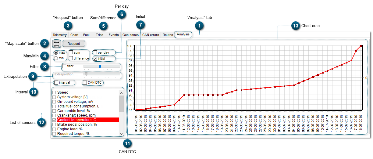
In the tab Analysis, the system displays telematic data from the sensor for a chosen time interval, filters local parameter fluctuations and displays the result as a chart.
To perform analysis, you need to select the type of sensor that records values of the paramater you want, and then you need to choose a time interval.
Geographic presentation of controlled parameters allows to observe what parameters tend to change. Above that, it is also possible to analyze mutial influence of several parameters and prognose changes of their values.
These are parameters of chart values display: minimum and maximum values received from sensor. Select min. or max. to see min. or max. values of the selected parameter.
Constructing charts with max. and min. values is performed with the help of algorithms. After data analysis, these algorithms select next bigger value or equal value to display it as max.value, and next lesser value or equal value, to display as min. value.
Here is an example of a chart with max. values of the sensor "Coolant temperature, Cо". Time interval is almost two months.
And here is an example of a chart with min. values of the sensor "Coolant temperature, Cо". Time interval is almost two months.
In order to evaluate some parameters, it's rational to analyze the sum of two values or the difference between two values. To do this, you need to request analysis of data from two sensors, and to put a tick beside the selected parameter. As a result, an additional chart (in green color) will appear. In this chart, you will see the sum of values or the difference between them.
For example, to evaluate technical state of the engine, it would be rational to analyze the values of required torque and actual torque. If the difference between these two values becomes bigger, it means that there are malfunctions.
This is an example of difference between values of required and actual torque:
In this example the sum of values of required and actual torque is displayed:
Extrapolation is an approximate estimation of a function's values in the points that lie outside of the set time interval, basing on the values in certain points of the time interval.
Application of predictive maintenance algorithms by extrapolating of charts of controlled parameters allows to predict a time interval at the end of which the value of a parameter will exceed the limits of the acceptable range. This information will allow to identify and eliminate malfunction in advance.
This tool becomes activated when the filter is activated:
Below is an example of the filter usage and the extrapolation of the chart with values of engine oil temperature:
With the help of the slider bar you can set the range limits for time of extrapolation that will be used.
This option allows to highlight a certain part of a chart. To do this, enable the option by selecting the checkbox: , then go to the chart area and left-click at the beginning of the required interval and at the end of it. As a result, selected interval will be highlighted in the chart as demonstrated below:
The list of sensors contains information about sensors (enabled in the Telemetry Panel). To edit the list of sensors, see the section Settings - Telemetry.
In the chart, values of sensors with selected checkbox are displayed (as you can see, checkbox for the sensor is selected in the list on the left; the line and the chart for this sensor are red). If you want to see two charts at the same time, you need to select a second sensor from the list with the mouse cursor (the line and the chart of this sensor are blue):